SituaTrack · Hospital · Casablanca
Thoroughness over speed.
01
Reports were arriving late, or not at all.
Intern doctors at Cheikh Khalifa and Mohammed VI took notes on paper or in phone notes, then transcribed them twice at the end of the day: into an Excel report and into an outdated hospital ERP. Everyone used their own format, so reports were incomplete and inconsistent.
Professors complained. Residents spent their time fixing errors. Sometimes a report took three days and a confrontation to arrive.
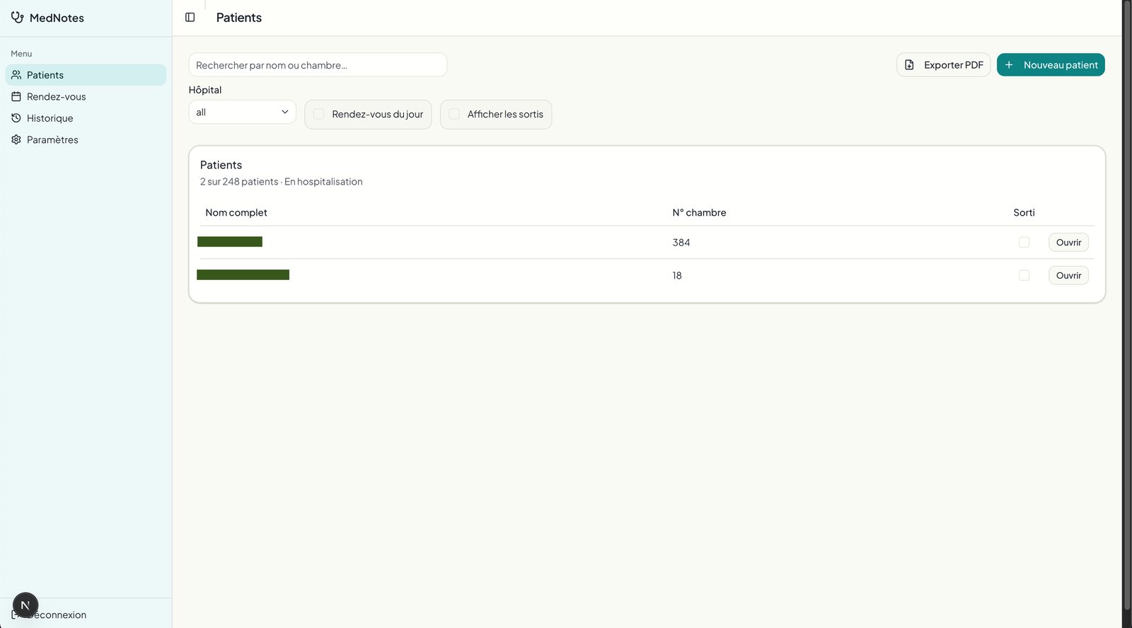
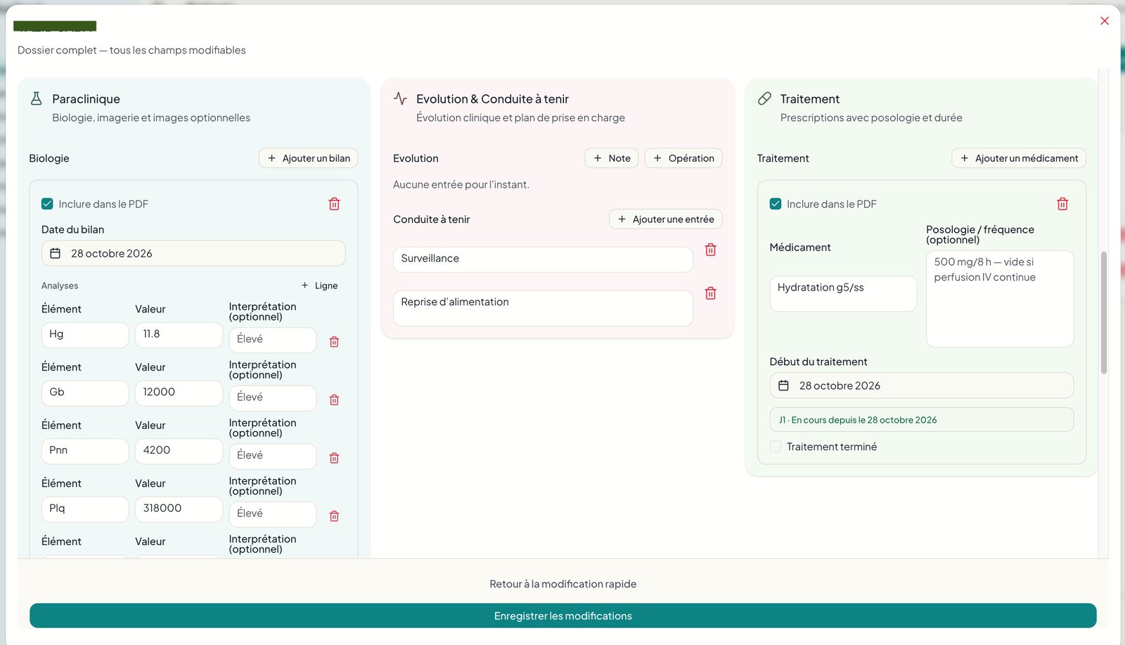
Users could only react to something real, and I had no access to the hospital ERP. So I skipped mockups. I shipped MedNotes, a single-user tool for the first resident, in two weeks. Once the team adopted it, they named it SituaTrack, because it tracks and reports the day’s situation. Field feedback drove everything after that.
02
Three jobs, one record.
Interns need to log consistently, with less double entry. Residents, the middle managers, want fewer errors to fix and faster onboarding. Professors want clean, consistent reports and usable data for research.
I spent a week in long interviews with a resident, who described the pressure from both sides. Quick, informal conversations with interns and professors continued through the build and became my feedback loop. 10+ doctors. 248 patients. One week of discovery, three months of iteration. I was the product designer and the developer.
03
I expected fewer clicks. I was wrong.
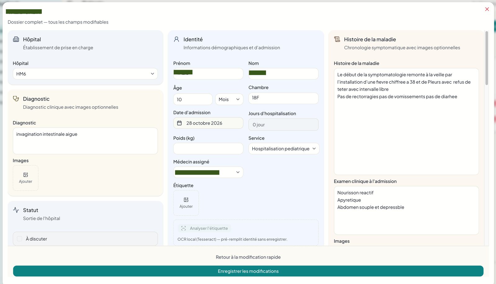
My marketing reflex said stressed doctors need minimal input. They wanted thoroughness over speed. I kept the detailed forms and made them faster to complete.
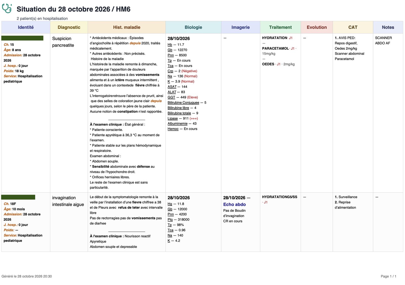
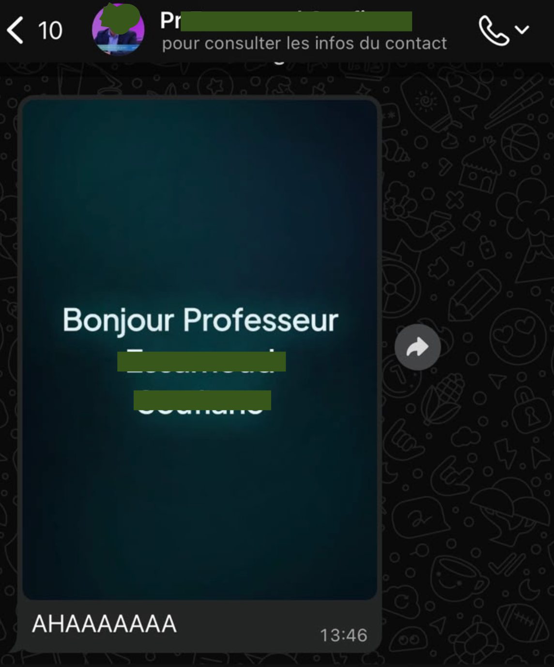
Status and presentation mattered as much as hardcore features. I wrote 364 rules to auto-style medical terms so reports read well, and a daily “Hello Doctor / Professor” greeting delighted users more than most features.
04
Morning: the situation du jour.
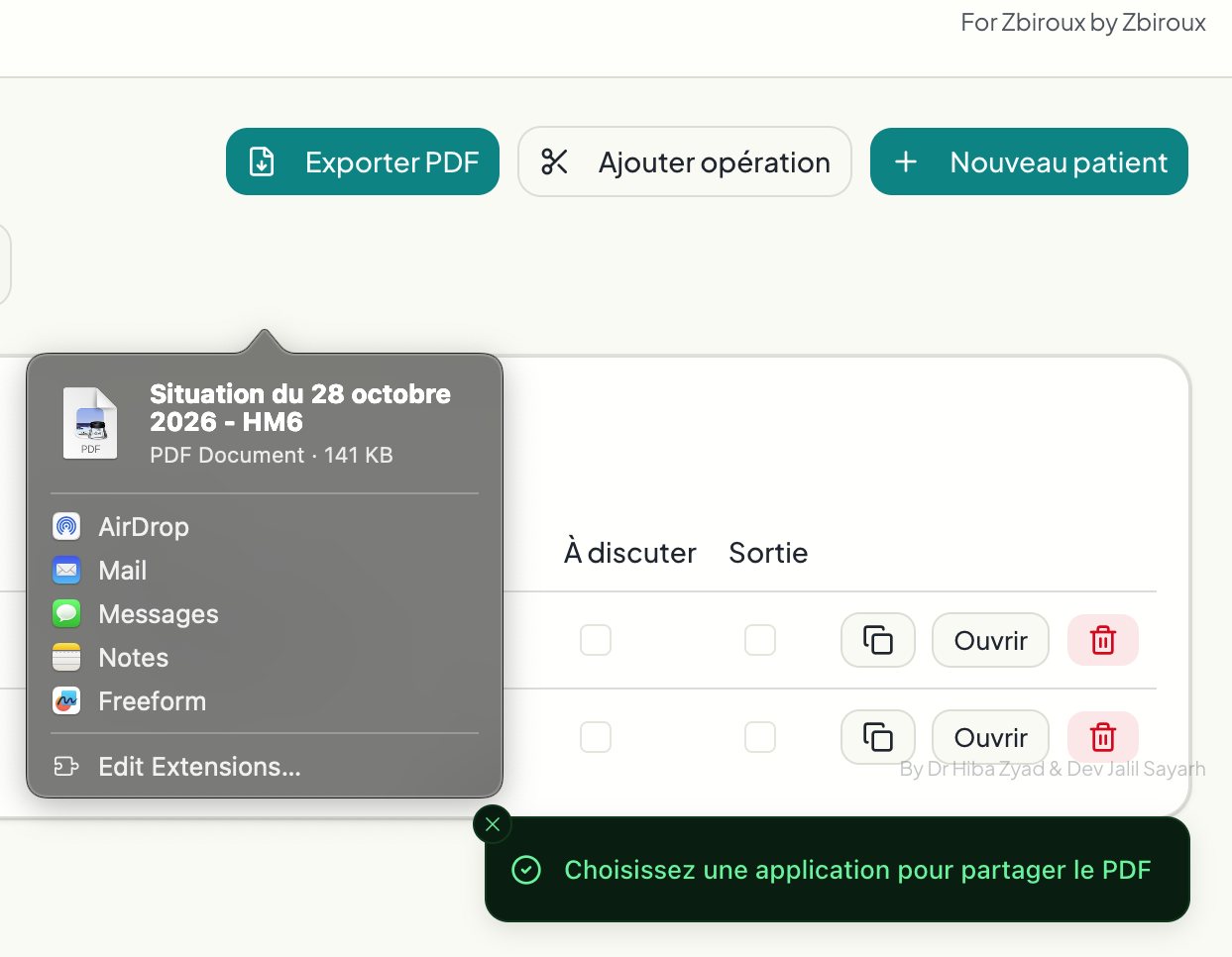
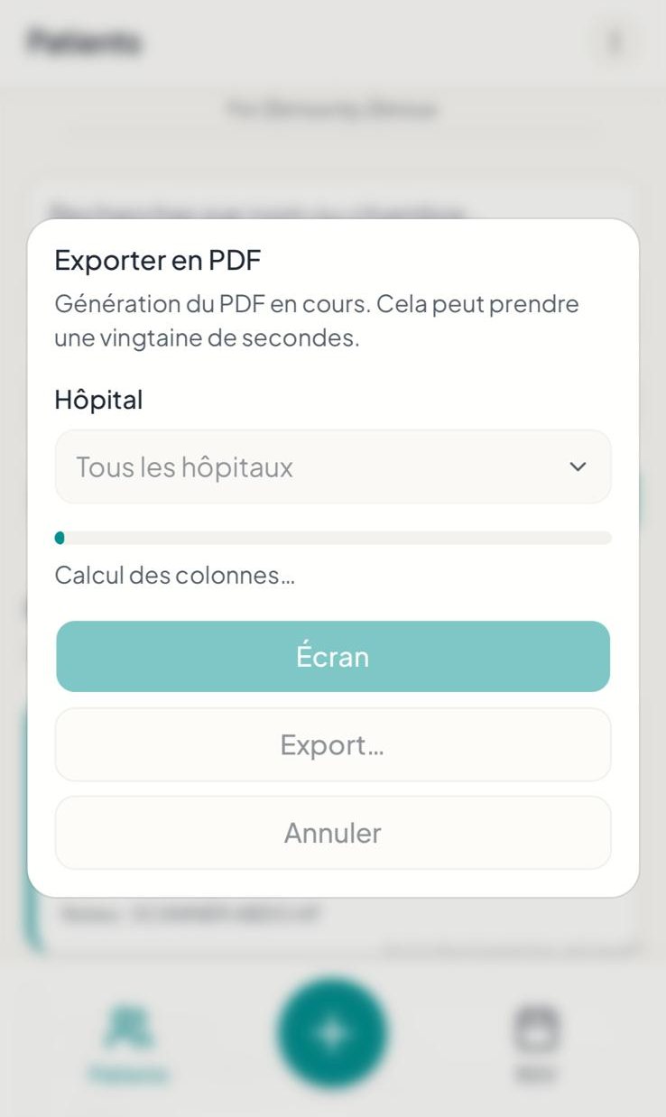
Interns login, and export the situation du jour as a PDF, then print it for rounds. I needed to make sure the site was always accessible through the hospital networks, and that the pdf extraction was always clean and readable in A4 format.
05
The round happens on a phone.
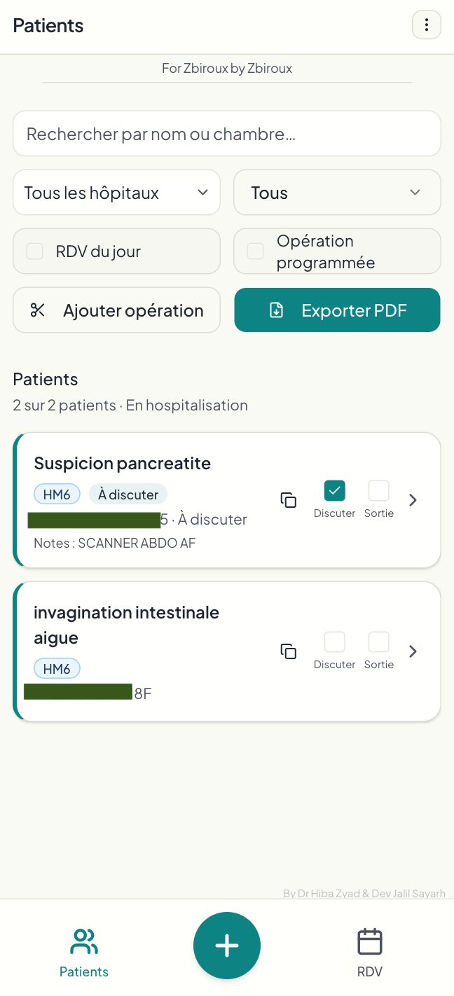
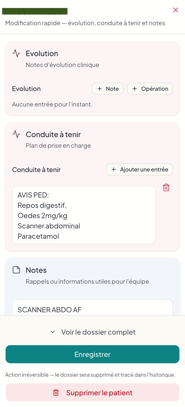
During rounds, notes are taken on the phone, and patients are flagged “À discuter” for the team brief. At the end of the day, the entries are checked on phone or laptop and the report goes out in one click.
06
The table is ordered the way memory works.
Diagnosis first, name second. Doctors often forget a patient’s name but never the diagnosis, so the cards lead with it.
With no ERP or barcode access, an OCR JavaScript library auto-fills patient data from tags. It is less accurate than a vision model, but it keeps entry fast and blends in with their routine. “À discuter” lets the team prioritise cases for briefs and meetings.
One-click copy helps the interns report to the legacy hospital ERP without wasting time on double entry. The app generates a full profile in a predefined text structure, ready to paste into the legacy software. This removes the worst part of the double entry which is mindless reformatting.
07
After month one, the ward asked for more.
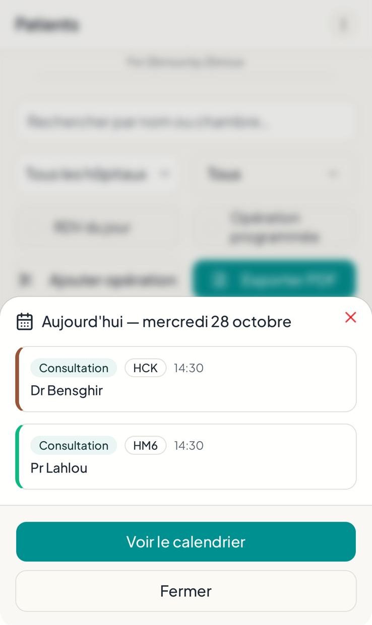
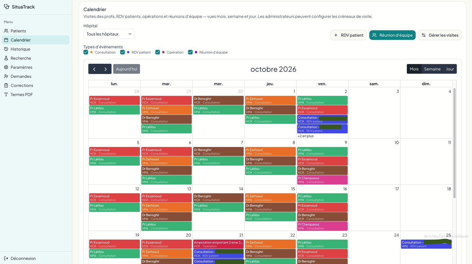
V1 covered note-taking and PDF export. After month one, doctors asked for appointments, a calendar and research. It started as simple appointment management and became a calendar for professor visits, team meetings, patient appointments and scheduled operations. A true hub for all the doctors needs.
The desktop menu grew from 4 to 8 sections. On mobile, secondary features moved behind a header menu, keeping Patients, Add and Appointments in the bottom bar, since those are the most used features. The other feature they asked for was a custom filter, which specialized doctors and professors who only see one type of patients.
08
A wrong deletion cannot be the end of a record.
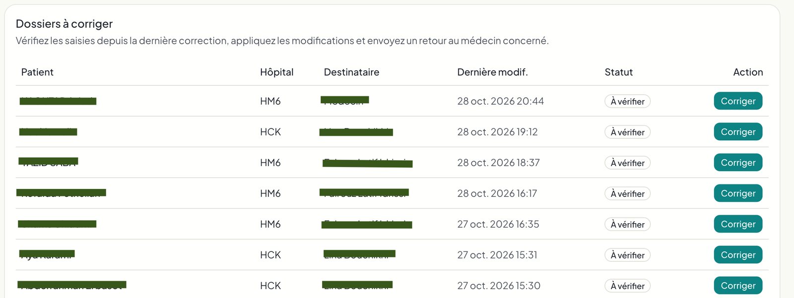
Admins can roll back any user action in one click, so deleting the wrong patient is never permanent. Residents are the admins. Only they approve new accounts, with a notification on connection and a smartphone push when the email is confirmed, so the list cannot be spammed.
My developer account only sees anonymised names and images, so I never access identifying or distressing content, I learned I needed that the hard way. Each profile sees a specific set of pages, with different access roles and strict row-level security.
09
The team had more time, and the arguments stopped.
Estimated from the team’s own accounts: 1 hour a day for each intern on reporting. 15 to 30 minutes for residents who no longer fix reports. 15 minutes for professors when errors used to surface.
Reports now arrive daily with one click. The unit dynamic changed too: less tension, no more arguments over who fixes what, clean reports for professors, and data ready to be used for research. Staff from other services have asked about the tool. Good products get Word of Mouth.
A resident, after month one: “I stopped filling out the forms, now it’s all the interns’ job, I’m so relieved. Everyone is thrilled.” An intern: “The site is incredible.” A professor, on the research feature: “The more I think about it, the more I feel it has crazy amounts of potential.”
10
What I took out of it.
My 3-click rule was the wrong heuristic for this audience. I now ask what “good” means to the users before designing. Building directly gave fast feedback but left no design artifacts. Next time I would sketch flows first and keep a decision log.
 Jalil Sayarh